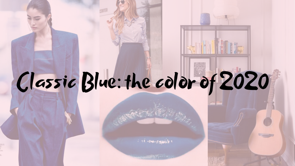
Classic Blue: the color of 2020
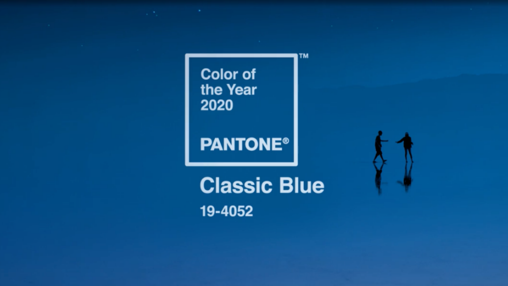
Another year goes away, another year comes and Pantone has already launched the shade for the new year: Classic Blue. It’s a dark shade of blue that might be considered a tone between the royal blue and the navy blue.
THE MEANING OF BLUE COLOR
The chosen shade suggests a dusk color and it brings a calming and tranquilizing effect for our soul. In times when disagreeing becames dangerous and aggressive, sometimes, it’s important for us to think in a brighter side, because that is what we really need to keep living: peace and tranquility.
In Chromotherapy, blue is linked to the frontal Chakra and its shade is classified by “indigo blue”, related directly to forgiveness, compassion and understanding. In my opinion, those meanings have all to do with our moment in this transition from 2019 to 2020.
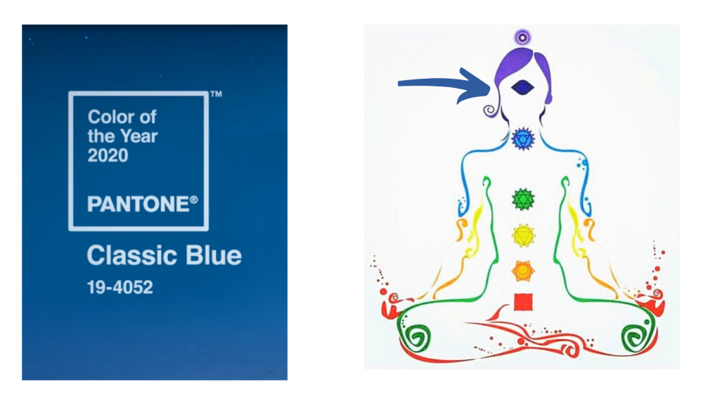
Its psycologic effect is mainly to heal and to calm down, which means blue can help you getting over heartbreaking feelings, pessimist thoghts and even insomnia symptoms. It’s a great color for decor objects, once Chromotherapy is effective when we look at some color, not necessarily when we dress it.
THE CLASSIC BLUE IN THE PERSONAL COLOURING
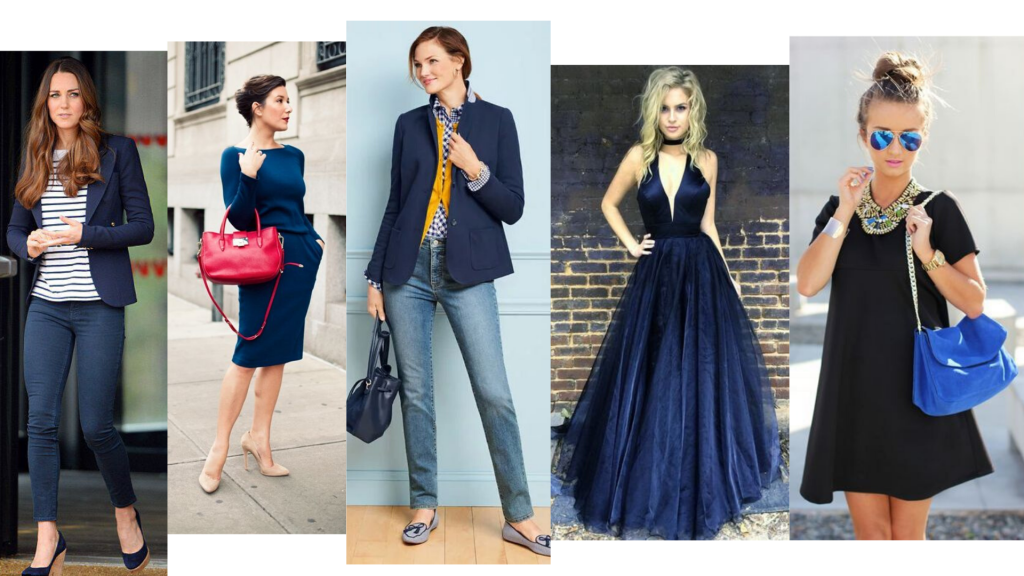
Because of its blue pigmentation, Classic Blue matches cold skinshades best than hot ones, according to the Personal Coloring Study. Of course it’s possible for every skinshade to wear it – you can try it wearing Classic Blue in lower parts of the body – such in skirts, shorts, pants and stuff. It’s an almost neutral shade that greatly replaces black options of clothes, so it fits colors of all seasons of the year.
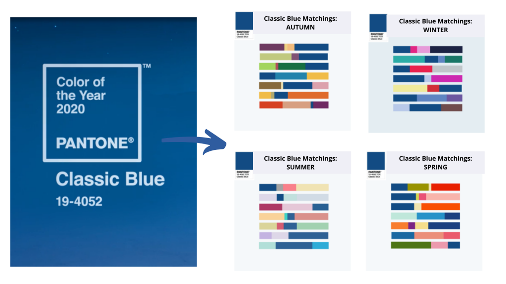
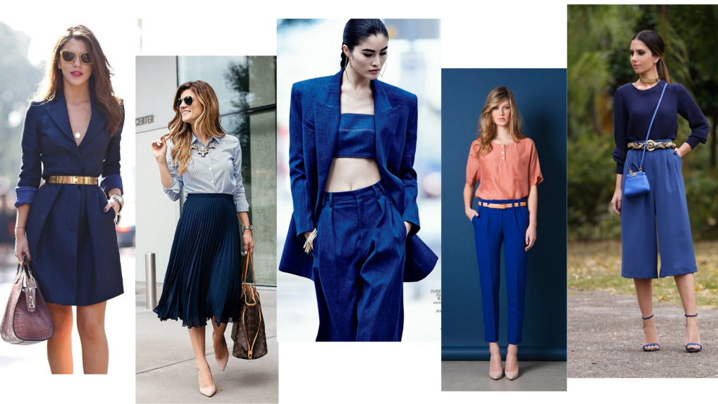
In a general way, we can consider Classic Blue kind of a navy blue “cousin”, as it’s a neutral shade such as grey, beige, white and black. I usually call it a “colorful neutral”, once it’s not so basic as black, for example, but it’s also an easy color to match another colors. You can try it in monochromatic outfits, in a color block outfit or even in color points of the look (in the accessory or shoes).
CLASSIC BLUE IN DECOR
As it was said before, Classic Blue is a wonderful shade for healing and it can be really useful in decor – at home or a work. It might also really good to choose it for party decoration – what about weddings? – or in Xmas, Thanksgiving or New Year’s Eve. At home, you can choose classic blue for pillows, towels, frames…
Once it’s a dark color is not indicated to be chosen for walls, as it can bring a claustrophobic sensation. But you can add it in details – it’s a color that makes any decor more sophisticated.
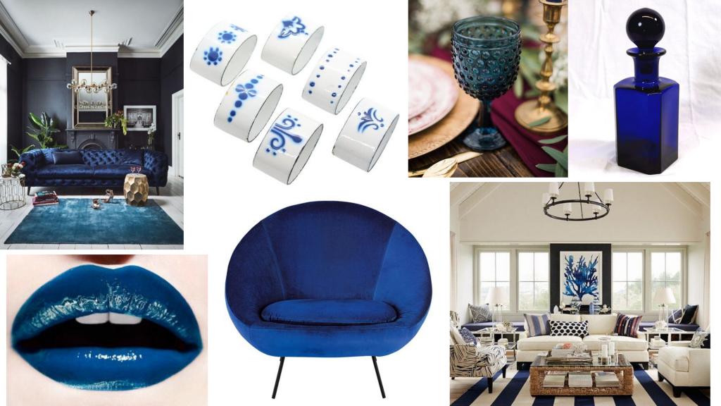
Do you like the Pantone color the year? Are you up to wearing it or bringing it to your decoration? Tell me in comments!
READ MORE: 5 tips on wearing vintage clothes
If you want an online personal consulting, fill the form and wait for my contact for we to start to work hardly in your Style! 😉
See you soon! Happy 2020!! Xx,
Marcéli
